How do you create space, depth, and distance in a two-dimensional photograph?
How can you communicate a sense of what the scene felt like—from your foreground to the faraway mountain?

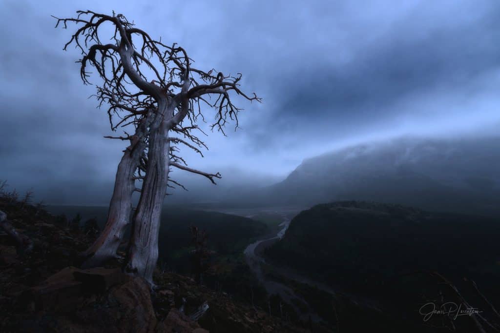
Dawn yields to a stormy, atmospheric sky that causes the distant mountains to fade away in the distance. These effects are further exaggerated in post. The Brother’s Sorrow — James Lorentson.
Photos with a sense of depth engage the viewer and invite them in to explore the scene. In another article I wrote, I shared six in-field techniques to add depth to your photos. In a follow-up, we explored how our cameras condense a scene’s dynamic range and reduce depth. So today, we’ll cover how to create depth and dimensionality!
We will look at how landscape painters, past and present, create(d) an illusion of depth in their paintings. Sadly, their techniques are seldom discussed in the realm of landscape photography. I love making connections between different art forms, and these same techniques are as effective in photography.
Atmospheric Perspective
No—we’re not talking about drones here. Atmospheric perspective—also called aerial perspective—refers to how the atmosphere causes distant objects to look hazy and blue. It is the result of the scattering of light by particles in the air.

Although the use of atmospheric effects has been implemented since antiquity, Leonardo da Vinci first used the term “aerial perspective” in his 1651 ‘Treatise on Painting.’ There, he wrote: “Colours become weaker in proportion to their distance from the person who is looking at them.” Here he uses color, tone and texture to emphasize the natural effects of distance in the far mountains. —Leonardo Da Vinci The Virgin at the Rocks 1483
The next time you have a view of the horizon, stop, and take it in. Things in the distance will generally appear lighter in value (fewer blacks), less saturated, less detailed, and closer in color to the sky.
When we view a two-dimensional photo, we rely on visual cues to help us perceive the three-dimensional characteristics of the scene. A

Created entirely in Photoshop, this digital painting masterfully incorporates atmospheric perspective techniques. Samurai Overlook — Walid Feghali
Painters have used atmospheric perspective effects in their work for centuries. And we can too. Let’s take a look at things in more detail.
What Causes Atmospheric Perspective?

Rayleigh Scattering of light causes the blue appearance of the sky. — Pearson Education 2011
Have you considered why the sky appears blue during the day and more red during sunrise and sunset? You probably have a feeling it has something to do with the sun. And you’d be right. But If you are like me, the information from your high school physics class is a little hazy. Here’s a refresher:
As a prism reveals, sunlight is made of all the colors of the rainbow. When light from the sun travels through the atmosphere, it is scattered and bounced by molecules in the air—primarily nitrogen and oxygen. Shorter wavelengths (higher frequency) like blue are scattered more than longer wavelengths like red. So as we look at the daytime sky, we see those wavelengths that are scattered the most.
Objects in the distance appear hazier (less black) because of tiny vapor, dust, and other floating particles filter and scatter the light. The further an object, the more particulate matter lies between you and it, thereby amplifying the effect.
Next, let’s drill down into each effect in more detail.
How Distance Affects Tone, Color and Texture
Lower Value/Tone

Looking Up the Yosemite Valley, 1863 — Albert Bierstadt
The value (of blacks) decreases with distance. Even on a clear day, distant subjects appear hazier (less black), since the light from those distant subjects travels through all kinds of particulate matter in the sky before it reaches our eyes. Shadows look noticeably lighter. As the distance between you and the mountain increases, the contrast between the mountain and its background (
Count the levels of black. Albert Bierstadt’s paintings demonstrate a close observance to natural phenomena, especially the quality of light.
Less Saturated Color

Colors (other than well-lit areas) are less saturated, paler/lighter in value, and shifted towards the colors of the sky (usually cooler in temperature). Distant objects’ colors blend with and take on some of the atmosphere’s colors. They lose their original color saturation and take on the atmosphere’s saturation.
In Layers of Azul, the distant mountains fade into the color of the hazy sky. The falloff in blacks and saturation communicates depth.
Less Detailed Texture

Even though the waterfall is relatively close, we see less detail and fewer blacks in the background. Some of the haze had to be added back in post. Drenched — James Lorentson
The further away an object is, the less detailed, textured, and defined it becomes. If a tree is close to us, we can see all the textures on the trunk and each leaf, but the same tree further away will appear as a simplified shape, without all the details. Receding objects lose their details, textures and surface details will almost disappear.
The more particulate matter between you and an object (e.g., dense fog, pollution, mist, clouds), the stronger the effect.
Horizons
[twenty20 img1=”1670″ img2=”1669″ direction=”horizontal” offset=”0.5″ align=”right” width=”60%” before=”Before” after=”After” hover=”true”]
Horizon lines halt the eye.
The hard line of the horizon naturally gets softer as it becomes more obscured by haze in the distance. But if you use a wide-angle lens, it’s important to realize that those awesome leading lines also create distracting horizon lines. Straight out of the camera, horizon lines can have too much contrast.
For instance, when I first pulled this image into Lightroom, a nasty black line cut through the scene. Softening the line to the way I remember it allows the viewer’s eye to travel to and through the horizon.
Photoshop Techniques to Analyze (and create) Atmospheric Perspective
You are most likely familiar with other methods to add depth in post-processing. For instance, you can dodge (brighten) and burn (darken) your image to shape the light and create more dimension. And you can add an Orton effect to reduce details and enhance glow. There’s some great information about these techniques elsewhere, so below we’ll focus on atmospheric perspective.
To add atmospheric perspective, it’s important to understand the levels of black and saturation in your images. And to do that, we can rely on a couple Photoshop tools:
Eyedropper and Color Panel (to analyze color)
Grab the Eyedropper and make sure you have the color window open.
Take samples from different parts of your image while you observe the saturation values.
Unless there is direct light in the background, the saturation should generally fall off from foreground to background.
Threshold (to analyze blacks)
A common tool of photo-compositors (used to match the level of blacks between different elements), the Threshold adjustment layer is seldom discussed in the context of landscape photography. And that’s a shame because it’s easy to use and really powerful.
A Threshold layer lets you see where the tones/levels in your image are located on the histogram. By dragging the slider from the left, you reveal the darkest tones.
Here’s a video of how to use both:
Edit with Intent
Be careful with autopilot edits that add contrast or shift blues in the background—you may inadvertently remove one of the most effective depth perception cues for your viewer. If instead, you use your knowledge and observation to harness the powerful effects of atmospheric perspective, you’ll grow in your study of nature, and your photos will tell that story.
A Caveat: You Don’t Always Need Depth

Here, a traditional sense of depth is much less important, choosing instead to focus on color, tone, and texture. Light and Shadow — James Lorentson
Of course, not all images need depth. For instance, many abstract photographs are successful precisely because they do not communicate a sense of being there. Abstracts typically use aesthetic characteristics themselves (color, tone, line, form, texture), while deemphasizing more visually descriptive features that explicitly convey meaning or objective facts (e.g., foreground, sun, grass, mountain, etc.)
Conclusion
One of the great challenges in landscape photography is bringing a three-dimensional feel to your two-dimensional photos.
There are many in-field techniques you can use to enhance the feeling of depth in your images. And when it comes to adding depth in post, many people rely solely on techniques like dodging & burning. But just like the master painters, landscape photographers have the post-processing tools to modulate tone and color to simulate atmospheric effects on things seen at a distance.
So remember: tone, texture, and color drop off in the background. You can transform the flat surface of your photo into a seemingly three-dimensional space by using less intense, more neutral color as you move back through the scene.

Look at this happy little mountain scene. A subtle drop in blacks in the distant mountains helps convey a sense of depth. — Bob Ross The Joy of Painting 1983-94.
If you want to learn more about post-processing, reach out! Until next time, wishing you grand adventure and good light!


