As someone with a foot in the ‘representative’ realm of photography through co-founding the Natural Landscape Photography Awards, it might be surprising to reveal that one of my favourite post-processing tools is the hue section of the HSL panels. Most people would think that the color of something is a fixed attribute and if you want to represent it, you should respect that color and only allow it to change through the moderation of the lighting it lives under. They might refer to the old-school color photographers who didn’t use any post-processing in their photography beyond choosing what film they might use. The thing is, film has been making hue adjustments since day one. Firstly, those adjustments were there because of the chemistry that was used in developing the film. Later, when the chemists were able to fine-tune the chemistry, the big film companies were able to make subtle adjustments to the way that film interacted with the colors of the landscape.
During the transition to digital, many photographers wanted to emulate that ‘straight out of camera’ look of their favourite films and, try as they might, they rarely achieved it.
“It’s only color? Why can’t I just adjust things in Photoshop?”
Well – color is a little more complicated than that. Firstly, color is a ‘human’ thing – i.e. there is no such thing as absolute color.

There is No Such Thing as Color
That’s a bit of a bold statement, so I think it’s worth going back to some first principles to try to explain things. What we think of when we say color is actually just one of the ways in which we, as humans, have learned to match something – let’s say a red berry – with something else – the red post box we saw in our books when we learned the names of colors as children. However, if we go to find the physical attribute of an object that is ‘red’, we quickly find out it doesn’t really exist. Our concept of red is based on the way that the rods and cones in our eyes are stimulated by the light that enters our eyes. If it’s mostly higher frequencies, we might say that it’s “bluer,” and if it’s mostly lower frequencies of light then we might say it’s “redder”.
If we’re looking directly at a light source, that light source has a distribution of frequencies of light that is termed the ‘spectrum’ (or spectral distribution) of light.
Let’s take a look at two examples we might use in our photography: warm daylight versus fluorescent light. Here is the spectrum of each light source with the horizontal axis being the wavelength.

What color are these light sources? We don’t know properly without knowing the sensitivity of our ‘receivers’. What the fluorescent light manufacturers have done is sneakily chosen some materials that just happen to roughly correspond with the cones in our eyes to stimulate them in the same way that the “full spectrum” daylight does. So to our eyes, they look roughly the same, a sort of warm light.
So we’ve shown that two light sources that have very different attributes look the same to our eyes. But will they look the same for a camera? Well, to know that we have to look at how the sensitivity of our eye compares to a camera.
Eye vs Camera
Shown below is a graph of the camera sensitivity (at the top) and our eye sensitivity. You can see that they are quite different. Because of these differences, what we perceive with our eyes can be different from the colors that a camera sees. In fact, the only way the two can match is if the camera had exactly the same curves for its red, green, and blue color sensors as the human eye. Even then, there is variance in eye sensitives between one person and another, so a perfect match is pretty much impossible.

A quick observation from the graphs above shows that the camera is a bit more sensitive to the long wavelength light than our eye. This works out as a little bit more red/infrared sensitivity. If we imagine both our eye and the digital sensor looking at the warm daylight, which happens to contain lots of extra long wavelength light, the color perceived would probably be influenced by that extra red and appear warmer.
Why do Things Look Different in Photographs and to Our Eyes?
We’ve shown that two light sources can look very different to a human eye. We’ve also shown that a single light source can look different to the human eye and a digital camera. Things get even more complicated when we actually want to look at or photograph “things”. Don’t despair though – this is a more practical example as we’re looking at some landscape photography ingredients!
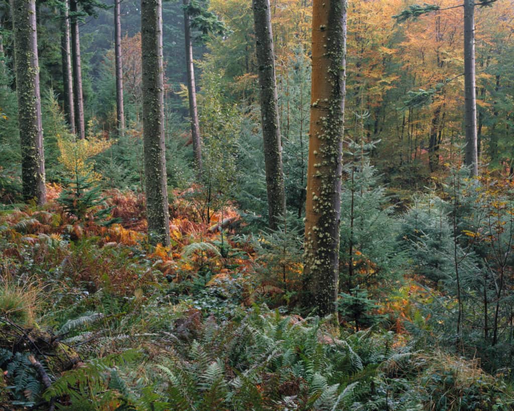
Let’s take a simple example of a few nice green ferns against a green-painted shed. The ferns and the shed look the same color to the naked eye, but for some reason, they look different to your camera. Why is this? When daylight arrives at either the fern or the shed, the amount of different frequencies reflected depends on the materials involved. In this case, the fern is mostly chlorophyll, and the green paint is a synthetic material (probably mineral ore of some sort).

The reflectance spectrum of chlorophyll is quite complicated, but the biggest difference is that it has quite a lot of reflectivity in the infrared spectrum, whereas the green paint has a simple reflectance spectrum, where it’s easy to see that green wavelengths of light get reflected more than red or blue.
Because the red channel in a digital camera sensor reacts more to infrared light than our eye does, the color of the light seen by the camera will have more red in it, and so they will look a ‘warmer’ green (yellowy green) whereas our eye sees them as cool greens (they may also appear a little lighter in intensity).
The green paint looks the same to both the camera and our eye though. So in our digital photograph, the fern and green shed will look different whereas to our eye they will look the same.
As an example of how different sensors see these chlorophyll-based colors, here’s a side-by-side I took some time ago to compare the Sigma DP1 color against the Nikon D800. Both frames were calibrated using a Greta Macbeth Colorchecker.

Some photographic films have different spectra that can make chlorophyll greens look cooler instead of warmer. For instance, Fuji Velvia tends to shift some greens to make them cooler and also appear darker. So we have three different renditions of the same scene using the same greens. This phenomenon is sometimes referred to as ‘metameric failure’ (although the use of the ‘metameric’ is probably incorrect in scientific terms).
Metamerism / Metameric Failure
The general definition of metamerism is where two different objects appear the same color under a specific light source, despite having different spectral reflectances – for example, you might have two different materials for a dress that look the same under the shop display lighting.
That is a specific case of some of the spectral effects discussed above. What is more interesting to us is something called “Metameric Failure.” Or to be more specific, “Illuminant Metameric Failure” and “Observer Metameric Failure”.
Illuminant Metameric Failure – This is the case where you might go into a store to buy a matching jacket for a pair of trousers. You find the perfect match, but when you go out into daylight, they reveal themselves to be different colors.
Observer Metameric Failure – This is possibly the one we are more interested in. This is where you photograph something that appears to match in real life but looks different when you photograph them with a camera (film or sensor).
How is this relevant to the photographer? Well, the perfect camera (or film) would be able to reproduce colors exactly as the human eye does. However, most cameras have some inaccuracies when compared to human vision. Some organisations have tried to quantify this using a system designed to describe the color ‘accuracy’ of light sources.
The Color Rendering Index is an old method (1940s!) of calculating how far away a light source is from being like daylight. It works by illuminating a set of materials with different spectra of light and assessing how far away they are from the way they would look under daylight. A modern version of this method is called the Color Quality Scale, which takes into account perceptual preferences (i.e., humans are very sensitive to differences in greens, so these get weighted as more influential).
An adaptation of these tests can be used to assess camera color accuracy and DxO used to publish the results of these tests, but they were fairly hard to find. Some cameras did very poorly (Phase P45, Canon G11 & 7D, and Fuji X10 & X100) whereas some were very good (Sony A900, Canon 5D (not the II), and Nikon D700).

It was interesting to see that the better sensors were ones that used stronger color filters on their bayer array. The Sony A900 had low ISO performance because of this but excellent color. The move from the Canon 5D to the Canon 5DII gave better high ISO, but worse color rendering as the color filters became thinner.
Color Adaptation
Our optical system has the very useful ability to adapt to changes in the color of a scene. You’ll have probably looked into a house as you’re coming home at night and seen very orange/yellow illuminated rooms, but when you step into the room, things look normal. When you are outside, your eye has adapted to the cool light of the sky (however dark it is) and so anything with a warmer light source appears yellow/orange. However, when you walk inside, the light source now encompasses your field of vision, and so your brain adjusts its white balance so quickly you may not even notice it.
This color adaptation is going on all of the time, from second to second. Next time you’re in a green field, look down at the grasses for a while and then quickly up at the sky. You’ll probably notice a magenta cast in the sky for a second or so. After you’ve realised this is happening, you’ll be able to flick your eye from grass to sky and see the subtle shifts in color as you look around a scene.
This adaption works whenever you have large areas in your vision of a dominant color, and so we can’t absolutely rely on our memory to give us accurate information about hue/color.
Why Does Film Render Scenes Differently Than Our Eyes?
We need to remember that Fuji and Kodak have spent many billions of dollars trying to work out what transformation of colors we like to see. For example, Kodachrome was an amazing film that made life richer and more engaging than it really was. It purified color, intensified blue skies, and created warm sunset tones.
Memory Color
Some of this was influenced by the psychology of color and how our brains work. For instance, if you ask some people to remember the colors of objects and pick them out from a color sampler, they almost always pick colors that are more saturated and tend toward ‘known’ colors. Things that are around red coloration tend towards traffic-light red; oranges tend toward a more citrus tone; etc. In effect, our memories are more like Kodachrome than reality!
In fact, our brains do more than just idealise color: they also have very strong links between what something is and what color we expect it to be. This seems obvious that if we see a banana, we know it’s yellow, but in experimental analyses looking at areas of the brain and how they fire when looking at certain objects, our visual cortex fires for the color yellow even when we’re looking at a black and white image of a banana [https://en.wikipedia.org/wiki/Memory_color_effect]. This ‘memory’ of what color things should be can really skew what we expect to see in an image, particularly when the light from the sky is quite varied in color and intensity.
Color Preferences
We also have a tendency to like cool shadows and warm highlights. This could be because on a sunny day, direct light has been warmed by the air, scattering blue light, but shadows get illuminated by the sky, which is mostly those scattered blue photons. This means darks tend to be cool, and lights tend to be warm on a sunny day. And who doesn’t want every day to be sunny? Most commercial films and also many digital camera profiles (e.g., Camera Landscape) include this shadow/highlight color distortion, which is something to be aware of when post-processing images.
Individual Color Characteristics of Film
The extent to which films have these distortions have dictated their popularity in certain genres of photography. Fuji released a couple of films with very different characteristics that appealed to different audiences (back in the day when Fujifilm was Fujifilm and not Fujicosmetics). Fuji Velvia 50 became a massive hit with landscape photographers, and Fuji Astia became a hit with portrait photographers.
These were for almost opposite reasons, with Fuji Velvia 50 stretching the hues of chlorophyll greens out, so blue-greens became bluer and yellow greens became warmer, creating more differentiation in natural scenes, whereas Fuji Astia suppressed greens a little but made yellows more orange – great for portraits; not so nice for landscapes.
The example below is from a comparison made between film and digital cameras for On Landscape (The Big Camera Comparison). This included Kodak Portra 400 film, Fuji Velvia 50 film and a few digital cameras. We’ve included the most ‘accurate’ camera for this example, which was (arguably) the Phase One IQ180 medium format digital back. The comparison shows a small section of bog, including rich grassy greens, mosses and plant leaves.
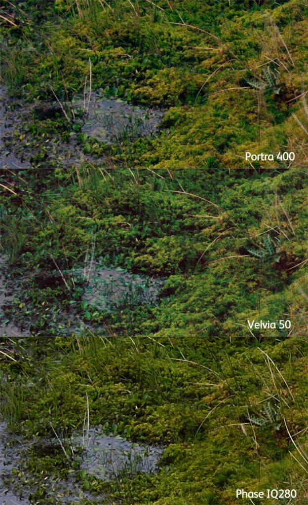
In comparison with the scene itself, the Portra 400 is undoubtedly the most accurate. The Velvia 50 has done it’s usual trick of separating out the various greens, leaving the yellow greens alone (mostly) but moving the other greens towards blue. This has created a lot more variety of tones but is definitely not accurate. Finally, the IQ180 has rendered the yellow greens well but has not differentiated some of the more blue-greens.
Camera companies have a trade-off, however. In order to get more separation between colors, the color filter arrays over the sensor have to be thicker/denser (i.e., so the blue pixels only get blue-colored light). However, to get full rejection of the wrong colored light, the filters would lose nearly two stops of light – or in other words, the low light sensitivity of the camera would be reduced by a factor of two.
You may think that we can just hue shift some of the colors to fix some of the problems exhibited above; however that can cause other problems. Here’s an example comparing an image from a Canon 5D Mark 3 with a Velvia 50 frame from a large format camera.

As you can see, most of the greens appear to be far too yellow, a common trait of many digital cameras, particularly earlier Canon models. We can fix these greens using a selective hue shift in the HSL tool in Photoshop as follows.

As you can see, this does fix many of the foliage greens, but it’s also changed the color of the lichen on the tree (where the red arrow points). So solving the issue like this needs to be done selectively because the color changes are metamerism related, not global.
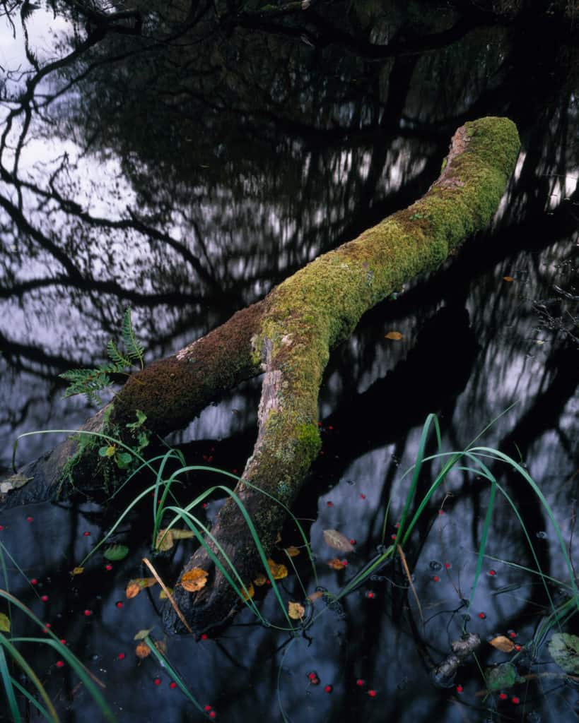
As a final image, I’d just like to include the most extreme demonstration of metamerism I’ve encountered in the wild landscape. Here is a photograph of some slate from a quarry in the Lake District, England which has various lichens growing on it. As you can see, straight out of the camera, the lichens are substantially different in the Velvia 50 image compared to the Canon 5D Mark 3.

You might also see that the green of the larch trees and mosses in the background of the Canon image are also more yellow-green than blue-green. Here’s an annotated picture of the items of interest.

If we correct for the foliage greens, so they look like the Velvia 50 image, look what happens to the lichens.

The hue shift may have helped the color of some of the larch and moss greens in the background, but the lichens look like something from a 1960s horror movie!
Lichen is an extreme example because they behave oddly under ultraviolet light, and the yellowy/green lichen above, called “map lichen” or rhizocarpon geographicum, has particularly unique UV properties. It’s even been tested in space for its resistance to UV damage. Just for reference, the actual color of the lichen to my human eye is somewhere in between the Velvia 50 and the Canon 5D Mark 3 representation.
How May We Use This Knowledge?
The biggest takeaway I would like people to have from this is that, for realistic image post-processing, using the hue slider isn’t sacrilegious. For many images, small shifts in hue, on top of the normal changes to saturation and tone, aren’t going to instantly make the picture look wrong. It already probably looks wrong in many different ways compared to the way your eyes saw it.
Considered changes to the hue of certain parts of an image can help differentiate those areas. They can also be used to create a scene that looks more like we remembered it. For instance, two changes I often make to my digital images are shown below.
Foliage
I take a few lessons from Fuji Velvia’s rendering here and manipulate some of the foliage greens (which are normally classed as ‘yellow’ in Adobe tools) and shift them slightly toward blue. This is possibly only by a few points in the HSL slider. I also darken all the foliage greens and perhaps desaturate them a little (depending on how they render with your camera). This can effectively stretch the range of colors of the greens represented in your picture, showing more differentiation.
Blue Skies
Quite often the skies in my images tend towards cyan, which can look a little acidic. I like to see a blue that is a light tone of ultramarine (perhaps not quite that magenta), and so I take the cyan areas of the sky and shift them toward blue.
These changes can be applied using selection masks, but I prefer to make them using masks and the HSL slider in Photoshop or the HSL panel in Lightroom (Oh how I wish this was more flexible!).
Through the use of hue, you gain the ability to create differentiation of color without needing to add saturation. Also, much like mastering a record for the radio, we are able to create a more dynamic mix that sounds (or in our case, looks) “louder” but isn’t.

A Final Note
Understanding color is a life journey. My own journey started when I began to scan color-negative film and make the color inversions myself. I realised that, in order to make a ‘good’ inversion, I needed to know the colors of objects around me and from that day I spend time when out in the landscape, observing color and making notes about what I’m seeing (mental or physical). Being able to recollect just how the color changes in the sky at the horizon or how the grasses and rocks look gives me a memory to refer to when post-processing. Also, the more we observe color, the better we can differentiate it and use it in our pictures.
Tim Parkin runs the On Landscape magazine and would like to offer NPN readers a 20% discount; members can access the code in the member discount section.